Wednesday, January 31, 2018

test pattern.


Derek Jarman's Blue (1993) is a 75 minute 35mm film that consists of a single static shot of the colour blue with voiceover written by Jarman himself. 
In Derek Jarman’s last film Blue, the monochrome glow of the projected frame echoes the artist’s fading eyesight, as the soundtrack evokes powerful images of the mental, physical and emotional strain caused by his terminal illness. Blue was completed in 1993, the year before Jarman succumbed to AIDS-related complications. [1] 
It features a variety of voices by actors including Tilda Swinton and musicians such as Brian Eno and Tony Hinnigan. The film's single colour was inspired by Jarman's visit to Tate where he found a monochrome painting by Yves Klein, hence the usage of 'International Klein Blue' pigment solution. This colour is described to be the experience of the journey from reality to the beyond.
The script, recited by actors and by Jarman himself, alternates poetry and narrative prose around different meanings and interpretations of the colour blue (melancholy, water, infinity, etc.), autobiographical episodes and invocations to a character called Blue. [1]
*

Ryoji Ikeda is a Japanese artist and composer who currently lives in Paris. His test pattern project began in 2006, and his most recent one [N°12] was shown at The Store in The Strand last year. Above is test pattern [N°5]. In this test pattern Ikeda converts data into binary patterns that are generated in real-time, thereby submerging the viewer into a confusing, strange and chaotic environment that benefits greatly from the sound design. Loud, ear-piercing noises and long periods of silence don't allow the viewer to settle for a moment.

Probing the essential characteristics of sound and light, Ikeda’s work bridges the worlds of art and music and challenges fundamental preconceptions of both through the intensity of his installations. [2]
BIBLIOGRAPHY:

[1]  Derek Jarman: Blue. At: http://www.tate.org.uk/whats-on/tate-modern/display/derek-jarman-blue (Accessed on 18/2/18)

[2] Anton Spice (2017) Ryoji Ikeda premieres mind-bending new A/V artwork test pattern [N°12] at Store Studios. At: https://thevinylfactory.com/news/ryoji-ikeda-new-test-pattern-n12-store-studios/ (Accessed on 20/2/18)

Sunday, January 28, 2018

diary of a sunday.


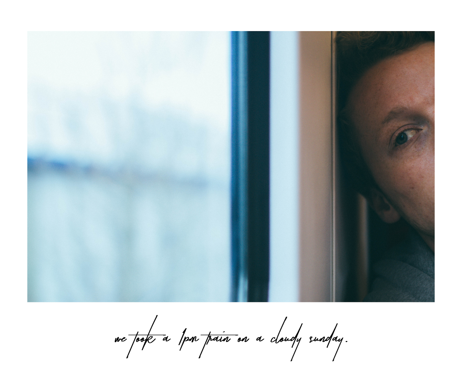
My six-piece series is of a Sunday. I thought I could just take photos throughout the day to create a diary of the day. Visually the photos might not look like they are a journey at first glance, but I quite liked changing the way I captured the images as the day progressed. I tried to mess around with the framing and depth of field a little. The first one was taken on the train. It's framed so it's only his eye and cheek in shot. The second one is his reflection in the window of an empty furniture shop. The third one is the side of his face in the park. The fourth one is the top of his head as he focuses on the video game. The fifth one is taken through the gap between him and his hands of a stranger in a coffee shop. The final one is an out of focus long shot portrait.

I like that none of them are actually a detailed portrait of his face but when all together they not only create that kind of sense of journey but also a sketch of him to fill out the blanks. Like I wrote before - 'Imagination is stronger than reality.'

I took over a hundred and fifty photos in one day so actually choosing six was the hardest part. I was tempted to add some images that weren't even portraits, or simply didn't go with the atmosphere of the story I was going for. 


Saturday, January 20, 2018

series: the challenge & the words

I wasn't very certain as to what the starting point for my portrait series was going to be until I saw Martha Rosler's Make-up Hands Up. I had never really thought about how close I was to the subject in my images - only how far. In this image one can only see a part of the woman's face, filled with wonderful, warm colour.


This made me think about how for most of my images I only use an aspect ratio of 4x5 or 5x7, only occasionally wandering further and using 1x1. I like the length of the image, and I also love the fact that the whole of the person's face cannot be seen.

The square image on the lady's eye is also something that I find quite fascinating. It's black and white, it's larger than her eye, it's the main focus of this photomontage. And yet it is the fact that it doesn't belong within the image that makes it so important.


To me series means a narrative. It doesn't have to be a flow, it could be parts of a thought - but there has to be a connection. I've always adored things that are, for lack of a better word, aesthetic. I like my images to be similar in theme and colours, same in size, otherwise I feel like there is a disruption within what I'm trying to convey, and I feel uncomfortable with the outcome. I realise that perhaps this is something I could challenge with this series of portraits. 

In the previous project I was particularly inspired by Yokomizo's series Dear Stranger, but one of my favourite photographers is actually someone who keeps a photo diary.

Jari Silomäki (born 1975) is a photographer based in Helsinki, Finland. His work captures scenes of nature and street, and intertwines them with news of the world. This is what spoke to me the most the first time I saw the images - the idea of simplicity and beauty merged with something that is so out of the artist's control.

I have always been interested in adding meaning to something seemingly unusual. I've always felt like photography allows me to capture what's going on in my head. I've always taken pleasure in imagining what soundtrack the drive through my hometown's forest would have, or what the voice doing the voiceover for my melancholic beach visits would sound like. What connected those was my need to show people how I felt - to create something so expressive that people would know and understand exactly how I felt. Everything around us has exactly as much meaning as we add to it.


'I woke up to Brexit. A moment after I took this picture the petrol can in my friend's hand exploded.' 
'Warm July evening at the lake Kuivasjärvi. A moment ago a Malaysian airline flight MH17 was shot down in the east Ukraine.'

About two years ago I emailed Jari whilst he was travelling around Eastern Europe. I wanted to know what My Weather Diary meant to him. He replied by saying he wasn't ever looking for a 'good' image, instead staying true to himself by taking a single photo per day, one that he felt did justice to what he felt and also captured his thoughts. For him taking a photo has become a mechanical movement, a part of his life and that's what his series represent.

There are series that require more accuracy but in My Weather Diary it doesn't matter if there are flaws or mistakes on the surface of the image because that's what it is - a diary - and it doesn't need to be perfect. It's there to capture moments worth remembering.


Another photograph that really spoke to me was This Photograph is my Proof by Duane Michals. Similarly to Jari's photographs, the image itself doesn't necessarily hold as much meaning the first time you see it as it does when you look at it after reading the text underneath.

'This photograph is my proof. There was that afternoon, when things were still good between us, and she embraced me, and we were so happy. It did happen, she did love me. Look see for yourself!'

So with these in mind, I've currently come up with a bunch of ideas that don't quite link together just yet. I know I want to focus on doing more close-ups, and I want to experiment with the aspect racio of my images. I think I'm still interested in including text. Recently whilst in a shop I was looking at their prints of recipes (image on one side, recipe on the other) and this idea's been stuck in my head as well, refusing to leave.


On top of that, I made myself purchase a box of small, triangle-shaped mirrors and dried a bunch of flowers. The mirrors are in response to this video (at 00:21) by BØRNS and I can't really explain why but the shot of his reflection in this mirror - an object that everyone has in their homes - that is also uniquely shaped really spoke to me.


Similarly to this, I was also fascinated by this photo by Rupi Kaur. I feel like there's something really interesting about the idea of a poet being muted by something that they use as metaphors.

And lastly, a thing that's been echoing in my head since the lecture a few days ago -
'Imagination is stronger than reality.'


There's a lot going on in my head and I'm not quite sure where this one's going to take me.

Wednesday, January 17, 2018

blues


A timelapse of an empty day going by.
(this is edit number two. edit one is here)

I don't think this was a successful attempt at working with time, mostly because my mind went blank and the only idea within it was a timelapse. I like timelapses because of the fluid way the image changes, and the fact that when you start, you don't know what you're going to end up with.

The timelapse in this video is reversed and consists of 45 minutes of footage sped up by 5000 percent. It's also reversed, and as my camera recorded it into four different files, I slowed each file down by 4 frames using Premiere Pro's 'Posterize Time' to interrupt this flow of time that the smooth timelapse created. The very start of this video is a very strange scene I happened to wander upon with multiple large lights turning on and off constantly for about ten minutes, which I thought was quite hypnotising.

The audio was a short journey between Charing Cross and Embankment on the underground, lasting fourty seven seconds (recorded on a Zoom and with a hallway reverb)


[..] but the most striking thing is the way that the machine pulls on your heart. you can actually feel it struggling to beat and changing shape…flattening inside of your chest. Its similar to that horrible sinking, tugging heartache that comes only with complete and overwhelming sadness. and then you pass out.

This is one of the heaviest videos I've seen in a while and it's not necessarily what it looks like - it's where it takes place and what it symbolises. Filmed inside a human centrifuge, they ran it eighteen times to get the lead singer to perform the whole of the song. His facial expressions change and the sweat on his forehead tells about the intensity of the experience. It is so strange to watch that I still haven't figured out exactly how it was recorded and edited. I just thought this was a fascinating video to do with time, movement and sense of heaviness.


In recent mainstream films one of my favourite uses of time was actually in Dunkirk. They used three different timelines, counting down to the main event: a week, a day, an hour and they took place in three different areas: air, sea and land.

These locations and times created a sort of a triptych - three unlinked pathways that all lead up to the big revelation. I found it amazing how the film changed between the times, relying on the spectator to keep up with what storyline they were following at that particular time. Needless to say, it was also the beautiful camerawork from Nolan and van Hoytema that played with the feeling of time, silence and chaos.

Saturday, December 9, 2017

/kəˈmjuːnɪti/


I absolutely love editing. Using Premiere Pro and After Effects is my favourite past time. After all of the footage was together, Emily went through it and selected the best shots to create the first draft. It went from twenty three minutes to seven, and from then on it fluctuated between five to eight minutes.

I used After Effects to animate some of the questions used for the interviews, as well as some other bits and pieces. 


At the same time I also used my Zoom mic to record two short speeches and colour-graded the clips one by one on Premiere Pro. It involved a slight increase in contrast and playing around with the temperature through intertwining other colours.

On Thursday evening I swapped with Emily and took her hard drive to spend the night editing. It actually took longer than expected for me to look through the footage again. The main problem we had was that the documentary was very visual at the start but then faded away into a more interview based ending. To attempt to fix this I cut it up slightly more, mixing it up with some of the shots we had filmed around town and within Farnham Park, although that won't make the final cut because we've decided to change it for more News footage.


The main editing I did was in the middle part where it focuses on what community means to different people. The storyboard started off as family, then going into religion, university etc. I changed this to be family and then go into music, fading away the sound afterwards to go into the speech about how community is more of a feeling. After the music shots, it was followed by the visuals I filmed (the seaside town being my newest community) and then changing into the next community, all connected through the audio track.

I enjoyed the short period of editing more than being the director of photography, and I do wish I could've animated a shot or two, as it was something I had been wishing to do since the very first idea I had back in October, but I'm glad I got to do some things on After Effects. I also enjoyed having the chance to put my opinion in the film as well through the audio.

The draft:
I think community's more of a feeling than anything else. You can't really describe it. Someone anonymous told us for them it's religion and their church. For other peers it's our creative university and the people they meet along the way. And who's to say it has to be physical? Poets are connected through poetry, perhaps they're not acquainted yet they're aware through words. And back when we were young, just children, weren't we all a part of a community as well? The playground was all ours. So.. that's what a community is.

Thursday, November 30, 2017

initial ideas & a wordy reflection on week one

At the start everyone in our production group had a drastically different idea for the topic they wanted to document. These included poetic (mine being about questioning the idea of a community and whether it had to be a physical one for it to matter; I wanted to explore the relationship between different poets and their connections) and musical documentaries, a documentary on Farnham Rants and another one on student finance.

In the end we sort of came up with a topic that managed to more or less intertwine all of them. The idea was to create a poetic documentary collaboration by using opinions supplied by others, written work, animations (both visual and text) and explore the meaning of community instead of focusing on a specific one.


We thought it would be interesting to see what people thought community really was and if they feel like they're a part of any, and whether the word community is associated with only positivity It was originally inspired by Ai Weiwei's amazing Sunflower Seeds because of the idea of people coming together to create (in this case, create a visual representation of community), and for my original idea the inspiration was this documentary on spoken word by Kate Church.

Initially the plan was to film in Lion & Lamb, however after I got in contact with Farnham Council and they informed me it was privately owned, it soon became obvious it would be very hard to actually get in contact with the agency that owned it. Instead, we moved our interview shooting location to Farnham Park.

On the day before the interviews, I wrote down the questions we were going to ask (just a reason for me to add some behind the scenes photos, really):


Looking back at it now, I wish we had put more thought into this. The questions were alright but they were... closed (thankfully the people we interviewed chose to follow up with what they meant). At the same time, they were also way too long and wordy, so in the end we got very different answers to the same question that barely linked together which proved to be difficult when we got to editing.


We had planned to shoot interviews on the 27th, however the morning was rainy and dark, so we moved the date to 28th and instead spent time filming the storyboarded intro which would be the opening shot with a cup of tea, following the poetry lines of 'What is a community? Is it a cup of tea shared with a friend?'

I said the lines out loud and it was quite nice, although later in post-production we realised that it was slightly too underexposed and dim for an opening shot. I later re-shot it in my own apartment in the morning to get more light. Personally I feel like it's quite a nice and colourful shot. The same happened with our projector shot that Emily later swapped for a recorded screen.


My role for the production was cinematographer. I was excited and couldn't wait to shoot. Reflecting on it, I'm not very happy with how some of the shots ended up looking. The interviews were very quick and there was a lack of directing so the people didn't stand in the framing I had previously set up, thereby we ended up with ever-changing shots as I had to adjust them for every single person. Perhaps this is only a small issue, but as the cinematographer I wanted to push myself to the highest of my ability and I don't feel like I did.

On top of that, midway through storyboarding the documentary, I realised there wasn't much work for me to do at all as there were so many individual animations such as stop motion, adobe animate and adobe after effects that there was almost nothing for me to shoot specifically as everyone ended up being a cinematographer anyway. That's probably the main reason I got so upset during the production - I felt lost in what I had to do.

Despite all this, I still had a quite fun filming week and it was a nice experience.

I learnt that:


  • I would work much better in a team where all roles were specific to
    a single person rather than blurred
  • communication is very important to relieve stress
  • more time needs to go into planning out small details such as questions
  • ...apparently cold weather can also affect productivity